The new Zonin’ identity is built on a foundation of clean typography and high-contrast imagery. I focused on the quiet moments of the grind: the morning walk, the pre-lift chalk, and the focused recovery. By implementing a minimalist visual language, the brand now speaks to a demographic that views fitness not just as a hobby, but as an essential part of their lifestyle architecture.
The Design Process
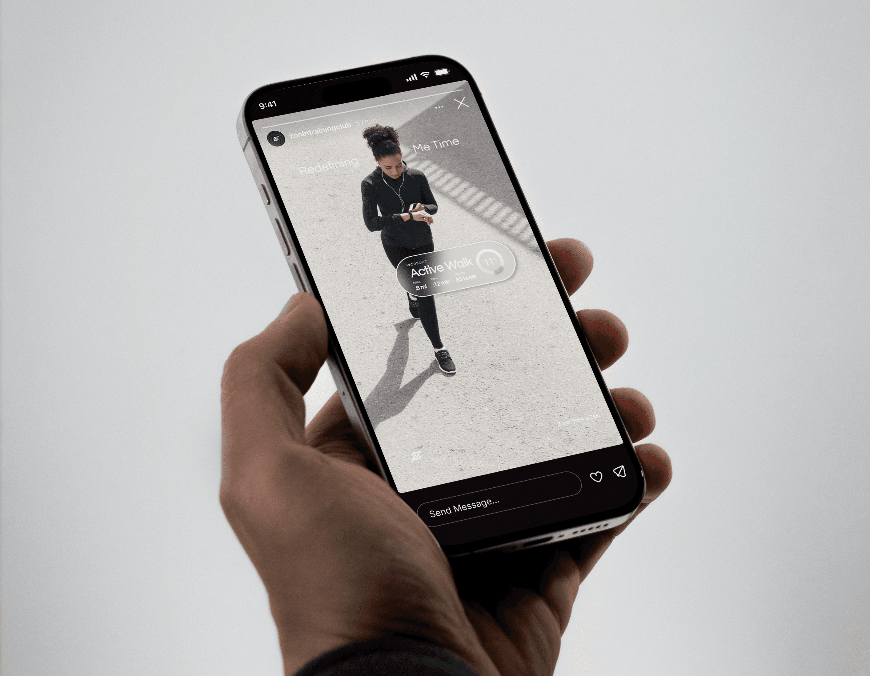
"The biggest challenge was making 'progress' feel tangible without cluttering the high-end aesthetic. We decided that the 'Zonin’ Way' meant being fully present and data-informed. To execute this, I developed a custom set of UI-inspired overlays for their social content.
By integrating workout stats,like workout sets, calorie burns, and rep counts, directly into the lifestyle frames, we turned every post into a mini-dashboard. This allows the athlete to remain the hero of the image while the data reinforces the brand's commitment to measurable progress. It’s a seamless blend of human effort and digital precision."
Key Deliverables Featured:
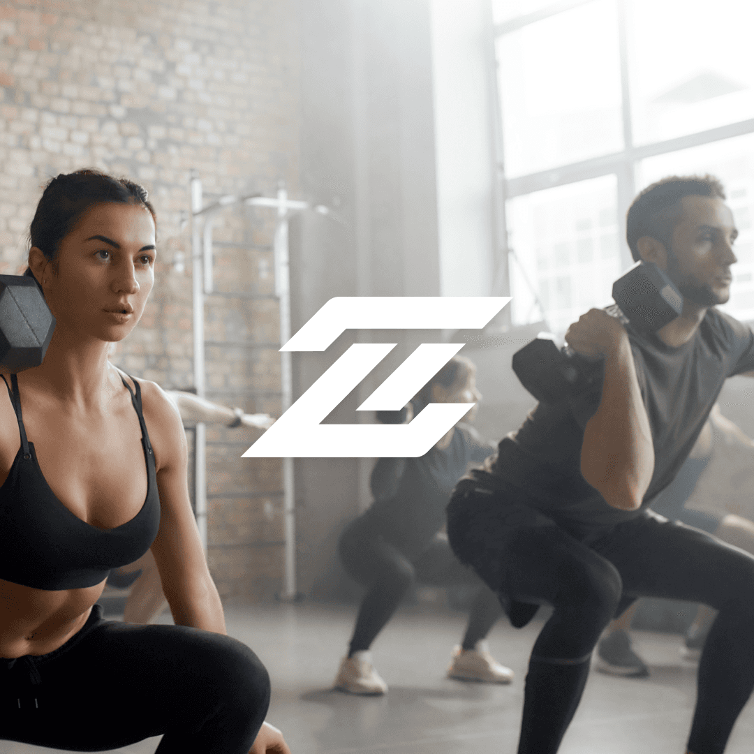
Visual Identity: A sleek, slanted "Z" monogram that implies forward motion and momentum.
Social Architecture: Instagram Story and Post templates that utilize glassmorphism and data-viz elements to track performance in real-time.
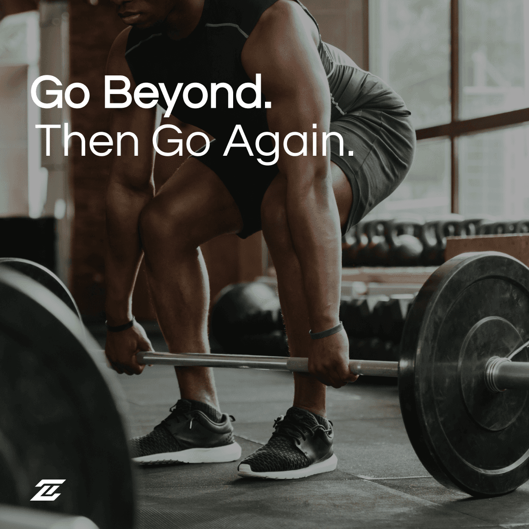
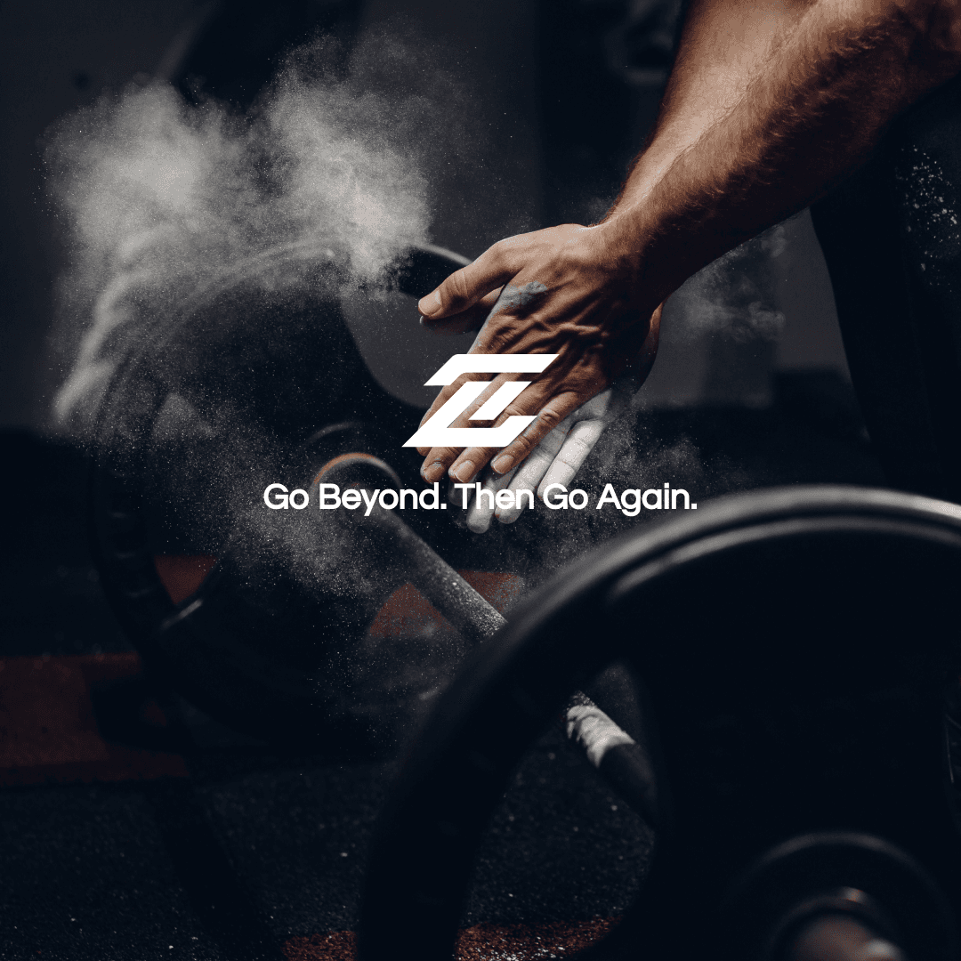
Campaign Copy: Punchy, motivating taglines like "Go Beyond. Then Go Again" to drive community engagement.